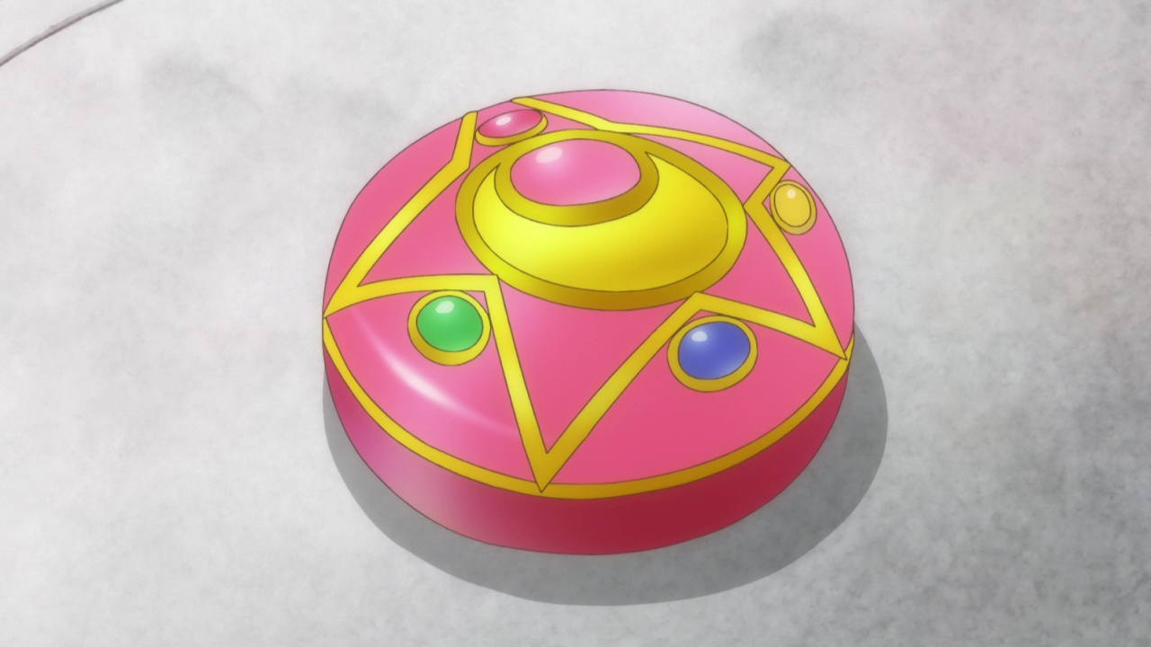
I’d like to thank a reader for sending this in because, I have to admit, that it the colors used in Sailor Moon’s brooch were just so natural that I never bothered to question it. But when you stop and take a look, you can’t help but wonder if there’s any method to the madness, any sort of order behind how Ms. Takeuchi arranged the colors as why. More specifically, the question posed is as follows:
“I would like an idea as to why the four ‘gemstones’ on the edge of Sailor Moon’s first brooch … are in the directions they are….”
“I mean why is the ruby north and not east? Why is the topaz/citirne to the east and not north? Sapphire to the south and not west? Emerald to the west and not south?”
From: Mythicall Moon
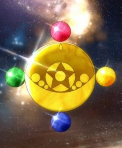
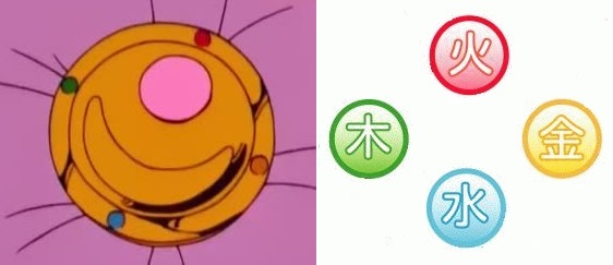
After taking a look at the myriad of brooches she wore all the way up to her Super Sailor Moon form, it turns out that the locations and colors of the gemstones has been consistent throughout: (from the top and going clockwise) red, yellow/orange, blue, green. I probably don’t need to tell you that the colors represent the other Sailor Soldiers and that the pink gem in the middle is in place of the Moon, but the order is definitely strange.
My first guess would have been that it has something to do with compass directions, much like with the colors of the Four Kings and their Buddhist connection, but as pointed out in the comment, that relationship doesn’t play out well here. The order of appearance of the Sailor Team doesn’t fit either, since that would be Mercury, Mars, Jupiter, and Venus. One possible explanation is that it’s the order of the planets from the Sun, starting from the bottom and going counter-clockwise, but that’s probably just coincidence. So, what is going on here?
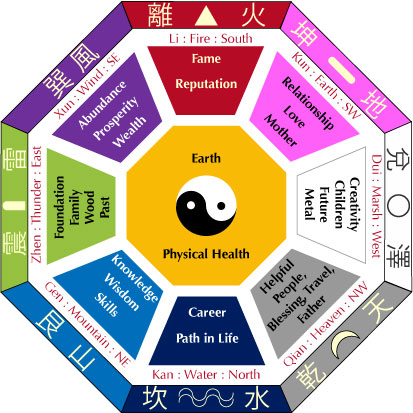
Well, after doing a little more research, I was able to come up with two possible explanations. The first comes from the ancient Chinese philosophy of feng shui1 and the idea of arranging your living spaces to find harmony with the metaphysical universe. The bagua map,2 in particular, associates elements with colors and directions, which may have been a possible source for her brooch.
Ignoring for a moment the meanings of the directions, you can see that the colors and elements match pretty well, with fire at the top, Jupiter’s joint representation of lightning and wood to the left, water at the bottom, and… well, marshes to the right (though it also covers metal!). It should also be noted that though this bagua map may appear to be reversed (with south pointing up), this is the traditional way of depicting it.
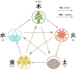
The other possible explanation comes from kigaku (気学),3 a Japanese style of fortune-telling4 based on the 12-year Chinese zodiac calendar5 and the five traditional elements of wood, fire, earth, metal, and water.6
In kigaku, fortune-telling is performed using the elemental relationships (determined through a matter of means, such as the year you were born, or more practical connections to an element) to determine the fortuitous or ruinous connections between people, events, things, and places in their lives. To over-simplify it, it’s something like a five-way rock-paper-scissors. The red lines represent a positive relationship (A gives birth to B; e.g., wood gives birth to fire) while green lines represent negative relationships (A suppresses B; e.g., fire melts metal).
Since the kigaku map is cyclical, there is no start or end to it and it can be represented it any order. Considering only four of the elements represented (the earth element being represented by either Mamoru or Hotaru, depending on who you ask), what happens if we re-draw it with fire at the top and cut out earth?
Though the meaning of the kigaku map is lost if you draw it this way (since the beneficial relationship from fire to earth and the negative relationship of wood to earth is missing), it does at least line up nicely with the colors Ms. Takeuchi chose to use for the brooch.
Ultimately, it’s impossible to say what the original intentions were for why the colors would up the way they did, but I do think it’s fair to say that Ms. Takeuchi is known for giving a lot of meaning to the names of her characters and background of the Sailor Moon universe, so I find it hard to believe that this is purely coincidence. As for which of the two theories I personally believe? I’d say I find the second one more convincing, but that’s mostly because feng shui doesn’t play much of a part in the rest of Sailor Moon while elemental relationships do. But what about you? Which do you think is the more convincing explanation?
References:
- See Feng Shui (Wikipedia) ↩
- See Bagua Map ↩
- See the definition of 気学 ↩
- See a Japanese write-up on kigaku ↩
- See the Chinese Zodiac (Wikipedia) ↩
- No, they are not “Earth, Fire, Wind, Love, and Heart”; see Captain Planet and the Planeteers (Wikipedia) ↩

OH, thank you for following my comment!
The “elemental” kigaku connection is rather interesting… I do hope you can do more in regards to obscure connections like this one, and a few others.
Thanks for the inspiration! It’s always interesting to hear what sorts of things other people would like to know about, even if the best I can do sometimes is just a “best-guess” effort. I majored in Japanese history in university, so any chance to look at how Japanese culture affected Sailor Moon is an exciting opportunity to me!
Wow!! Awesome sleuthing! Makes me wonder about the other gems on her Cosmic Heart Compact!
Glad you found it interesting! I definitely need to look at the other brooches eventually.
I know this article is a bit old, but I thought it was worth pointing out that the order of the gems is not consistent in Naoko’s colored artwork:
(From the top, going clockwise)
http://mangastyle.net/images/artbook1/sailormoon-artbook-1-11.jpg – Blue, yellow, green, red
http://mangastyle.net/images/artbook1/sailormoon-artbook-1-10.jpg – Green, yellow, blue, red
http://mangastyle.net/images/artbook1/sailormoon-artbook-1-12-13.jpg – Yellow, red, green, blue
http://mangastyle.net/images/artbook1/sailormoon-artbook-1-19-20.jpg – Blue, yellow, green, red
http://mangastyle.net/images/artbook1/sailormoon-artbook-1-39.jpg – Yellow, blue, green, red
http://mangastyle.net/images/artbook1/sailormoon-artbook-1-46.jpg – Yellow, blue, green, red
http://mangastyle.net/images/artbook1/sailormoon-artbook-1-53-54.jpg – Hard to tell because one of the gems is hidden and the angle is weird, but looks like it might be Green, [yellow], blue, red
The red, yellow, blue, green order seems to be the most common overall, but the fact that Naoko often switched the order around in her illustrations leads me to think that the order is of no special significance.
Interesting… thanks for taking the time to pull these reference pictures up, and the orders of the gems.
As you mentioned, it looks like she swapped it up a lot in the beginning, which could very well mean that there isn’t any special meaning to the order.
Another possibility is that there wasn’t any meaning initially and, as she developed the characters and the series, she ultimately settled on the order that we see in the original anime, Crystal, and many later manga pictures.
As with many of these theories, it’s hard to know for sure!
Apologies for resurrecting an old post, but if you draw a line in the order of the Soldiers appearing (Mercury, Mars, Jupiter, Venus) it spells out the number four. Not sure if it’s a happy coincidence?
Also fabulous website – thanks so much for your hard work xx